The Fed Ending Quantitative Tightening and What that Might Mean for the Future.
The Pioneer Perspective - Special Edition!
What We’ll Cover:
· What is QT? How long has it been going on?
· When have we seen shifts of QT to QE in the past?
· Are there any similar coincidental indicators?
· How are we positioning currently and forward looking?
The news that broke this week has been too significant to wait for our monthly newsletter, so we are doing a special edition. With crypto being more unsure of itself than Brutus trying to figure out if he should just ask for a promotion, Japan’s economy in question, and other equities volatility concerns, there’s a lot to cover. The most significant news though, is the Federal Reserve officially ending quantitative tightening. QT is the monetary policy set forth by the Federal Reserve to shrink the money supply by limiting the purchase of things like bonds. When the central bank stops buying up treasuries demand drops, which takes down the price of the bond and INCREASES the yield (bond prices and yields are inversely correlated). This is why the United States has experienced elevated bond yields in the last few years. The ultimate goal is to discourage spending in order to cool inflation.
Our most recent iteration of QT began officially in June of 2022. You may recall that the YoY inflation report came in at 9.1% that month! Inflation began ramping up in September of 2021 and we were given the famous line by Fed Chair Jerome Powell that “inflation is transitory.” It took the Federal Reserve nine months to actually take measures to act on clearly rising inflation. Was the Fed late to the QT party? I suppose that doesn’t matter because it’s far in the past. (But the answer is obviously yes.) From there, the US economy endured elevated interest rates, bond yields, and a tightened central bank balance sheet until December 2, when the Fed finally decided to end its three-year QT cycle. Were they too late to act this time? We all know President Trump thinks so, but only time will give us the sure answer.
When we take a look back in history we see two times where the Federal Reserve has engaged in QT for extended periods of time. The first is in October 2017 which lasted for two years until September 2019. This era of QT was the result of almost a decade of on-and-off periods of Quantitative Easing (QE) resulting from the 2008 bust. Due to extensive QE to help the economy recover, the Fed eventually realized it needed to reign things in. As mentioned, the second iteration of QT began in June 2022 as a way to bring down heightened inflation levels not seen since the 1970s. Now that QT has officially ended it seems the reason for the change is the Federal Reserve is worried about financial stress in the markets and bank reserve levels. Here is a chart with purple shading depicting the last two major QT cycles. For added context please observe the trend line that the S&P 500 has been trading in, dating back to the March 2020 COVID-crash bottom.
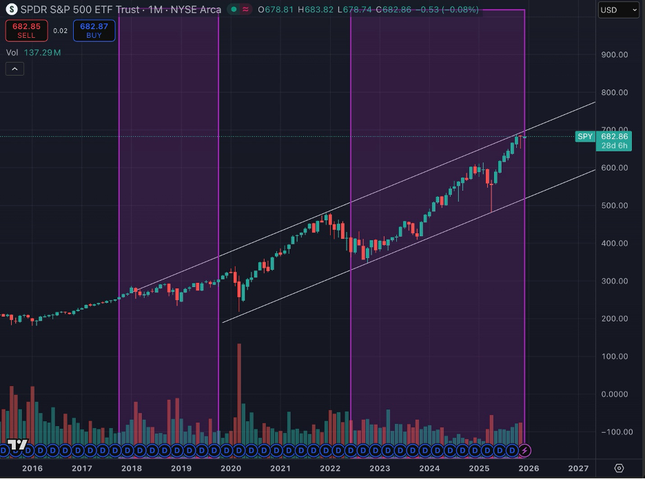
Retrieved from https://www.tradingview.com/chart/PAIfo4NN/?symbol=AMEX%3ASPY on 12/3/2025.
As you can see from the chart, it appears we are due for a sharp correction soon. However, technical analysis doesn’t mean much without context, so let’s talk about some coincidental indicators.
History doesn’t repeat, but it does rhyme. Let’s go over some significant similarities between where we are now, and where we were in 2007. First we’d like to talk about the 3 Year T-Note. Under normal circumstances, the 3 Year Note will trade just above the prevailing interest rates. This means the market predicts that three years from that time the interest rates will be roughly below the yield value, so you can net that amount of cash at the maturation of your bill. After all, you’re putting your money away for three years, so you deserve a better rate. What is crucial here is when the 3-year begins trading BELOW the prevailing interest rates. This can only mean one thing, which is the market has decided that the Fed will have to continue lowering rates. Short-duration bonds are the most sensitive to market changes and interest rate risk. Please take a look at the chart below.
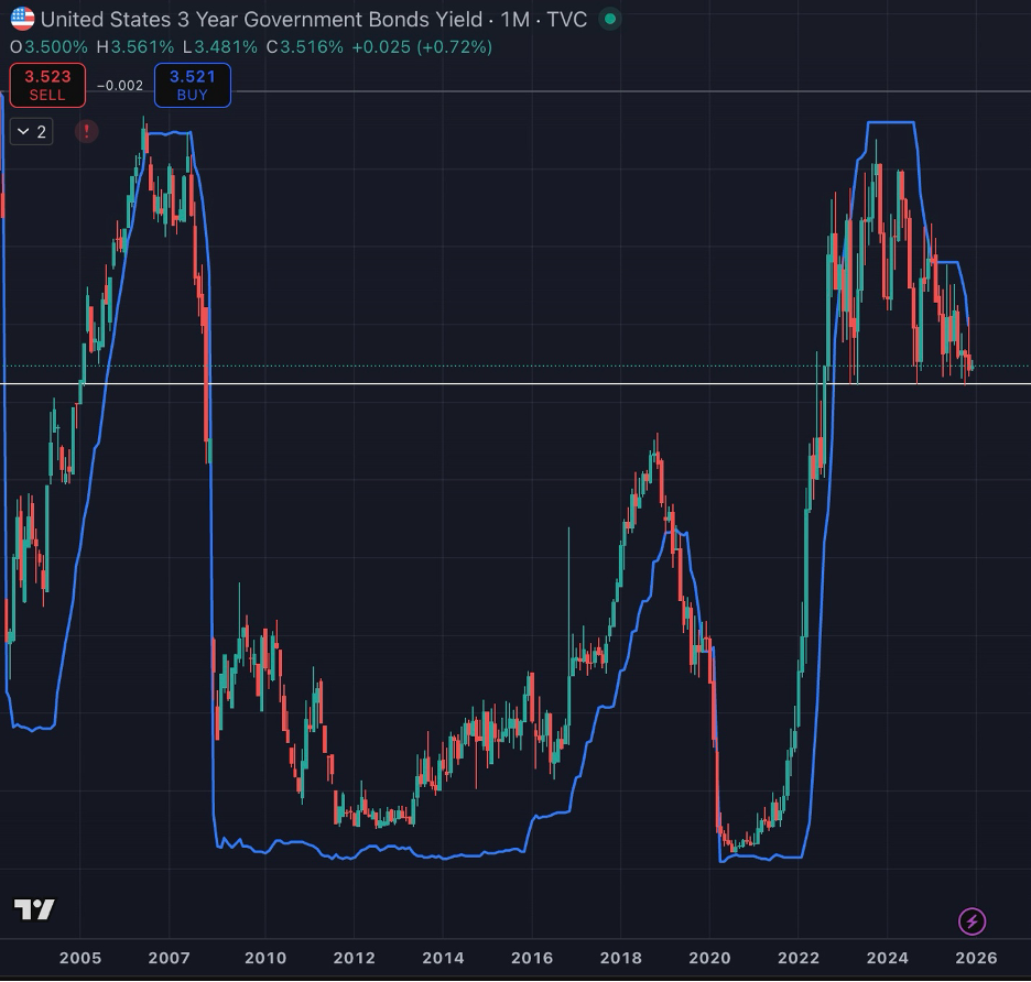
Retrieved from https://www.tradingview.com/chart/PAIfo4NN/?symbol=AMEX%3ASPY on 12/3/2025.
The above chart is the yield on the 3-year, with the blue line being an overlapping chart of the Federal Funds Rate. Please note that under normal circumstances, when the Fed is neither cutting nor raising rates, the T-Note trades above the prevailing rates. Next, see that when the market anticipates the Fed will begin a rate-hike cycle the T-Note STILL trades above the prevailing rates. THE ONLY TIME IT TRADES BELOW the prevailing rates is when there is a strong cutting cycle imminent. You can see from the chart that this phenomenon took place in July 2006-November 2008, then from March 2019-April 2020, and finally from January 2023-Now. The horizontal white line is a support level of 3.39%, which broke in November 2007 and has been tested five times in the last 3 years, including right now. We will be paying very close attention to that level.
Interesting Fact: We aren’t using this as any sort of guide, but the stock market peaked in October of 2007 before the great recession. So far, our recent peak remains October 2025. ***Insert Twilight Zone theme song***
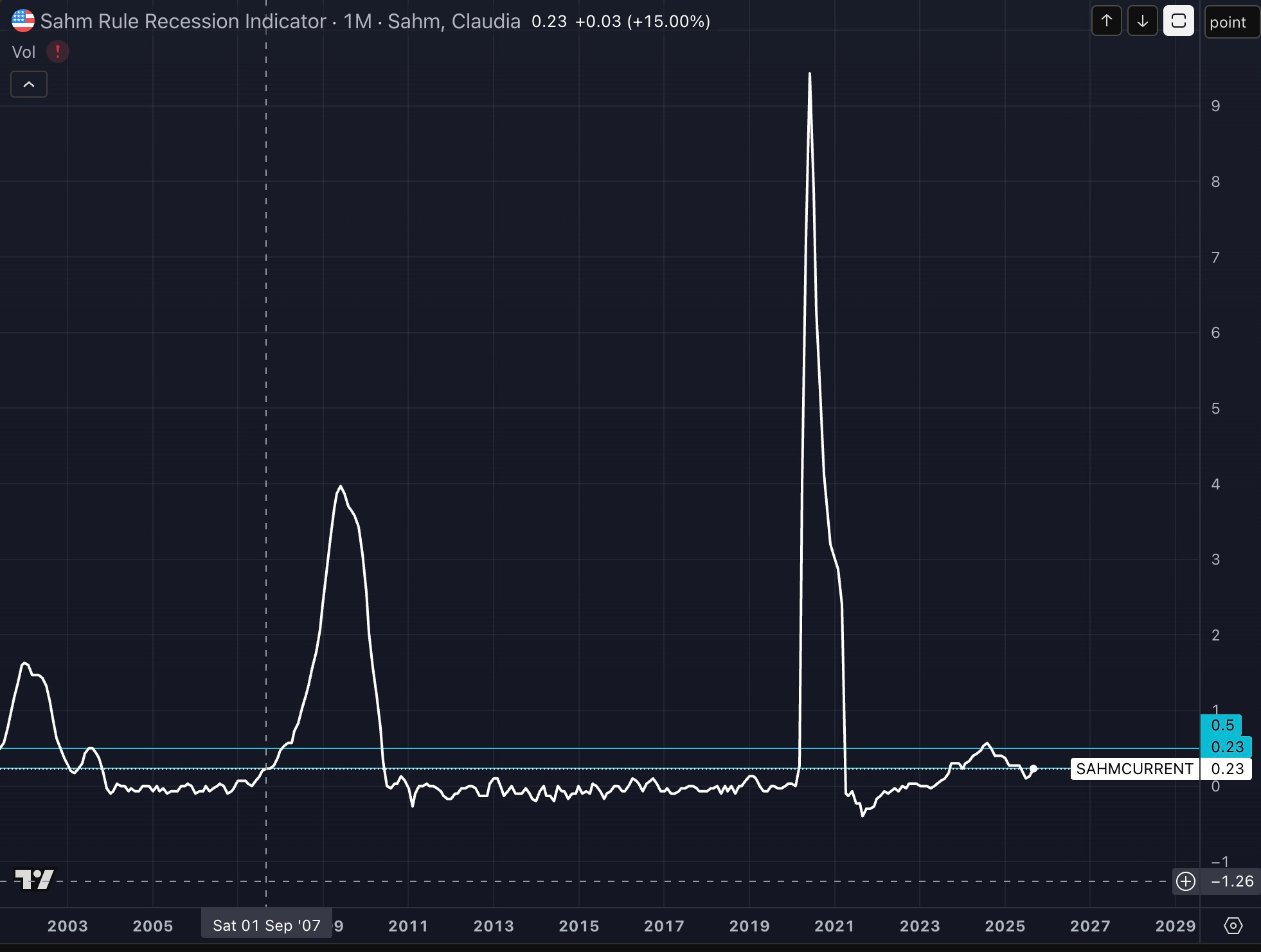
Okay, fine… We’ll give you one more piece of pretty interesting data. Let’s talk about the Sahm Rule Recession Indicator. The Sahm rule is an algorithm that has predicted every single US recession dating back to the 1970s. It measures the 3-month moving average of US unemployment rates. It’s pretty simple, when the 3-month average increases by more than 0.5%, a recession has begun. What’s interesting is that this alert was actually triggered back in August 2024, but then it dipped back down, so Bloomberg pretended it never happened. What’s more interesting is that it is rising again. Specifically, in September 2007 the Sahm rule showed a 3-month average of 0.23%. Would you like to take a guess at what the Sahm rule showed in September of this year? 0.23%, whoa! You go, Glen Coco. Now, because of the government shutdown we are still missing October data and November unemployment is scheduled to be released on December 16. What was the Sahm rule at in December 2007? It was 0.37%. If on December 16 we get a report that puts it at the same level then we are mirroring the pattern of 2007/2008. See the chart below and note the teal horizontal line that is the “official signal” as well as the current level of 0.23 and the vertical dashed white line marking September 2007.
So how are we positioning for all of this? Over the last 4 years, aside from 2022, this market has proven to be the most bullish and resilient entity since Sir Ernest Shackleton (check him out in your spare time, absolutely wild.) Anyways, because of this market resiliency/euphoria we still want to make sure and keep exposure to risk-assets. We are currently allocated in SPY 0.24%↑ , FBTC 0.90%↑ FETH 2.51%↑ , and a couple other small-cap stocks. Our core position is bond ETFs, TLT -0.64%↓ and IEF -0.49%↓ . We also have some energy, real estate, and little bit of FXY -0.21%↓. (Separate newsletter to follow explaining the Yen Carry Trade and why we are long FXY.) We believe that the economy is slowing, every data point with the exception of equities markets demonstrates this. However, more money has been lost trying to time market corrections than has been lost from the correction itself. To mitigate timing risk, we are not going to pretend we know when it will happen, but we want to be prepared if it does. With our portfolio allocation we will still benefit from continued all-time highs, yet if the market has a sharp drop then we are positioned for that as well with our bonds. As long as the economic trends continue, we will continue to INCREASE our bond exposure and DECREASE our risk-asset exposure. Eventually something will have to break, and when it does our bonds will put us in a position to sneak away with capital gains while everyone else is hurting.
Thanks for reading. Good luck out there and Godspeed.
*** For a more comprehensive analysis of our asset allocation (with our allocation*** pie-chart) become a Gold Member! Going live on January 1st. Link below.
https://pioneerfinancialllc.com/products/platinum-bundle-package
Disclaimer:
This content is for informational purposes only and does not constitute financial, investment, or legal advice. Opinions expressed are solely those of the author and are subject to change. Past performance is not indicative of future results. Investing involves risk, including possible loss of principal. Readers should consult a qualified financial professional before making any investment decisions. Pioneer Financial, LLC and its affiliates assume no liability for actions taken based on this material.